The use of wood as a tool for printing text has been employed for centuries. The Chinese first carved their alphabetical characters into individual pieces of wooden type in 868 CE. However, history, technology, and resources combined in an interesting way in nineteenth-century America, creating an aesthetic trend in printing that drew on historic type style and designs, but also innovated in news way that had not been seen before. As westward expansion brought Americans to settle across the country, the demand for printers and new printing technology also grew. The routing and pantograph machines allowed the forested land to be converted into wood type, which could be produced as a less expensive alternative to metal type. This new technology enabled new fonts to be developed around historiated letters that were typically used as display type. Now, entire alphabets of new fonts were created in a distinctly American aesthetic and in sizes not previously available.
John Horn was first introduced to printing in high school in the mid-1960s. He would go on to work as a commercial printer for most of his life. After retiring in the 1980s he began collecting historic printing equipment and type and immersed himself in the history of printing and typography. He now is the owner of his own letterpress studio, Shooting Star Press, in Little Rock, Arkansas. He owns 2,700 fonts of metal type, 1,200 fonts of wood type, hundreds of fonts of line casting matrices and over 200 presses. He draws largely from American Wood Type: 1828-1900, Rob Roy Kelly’s seminal text from 1977, for identifying and dating the wood type in his collection—situating American manufacturers as innovators in style.
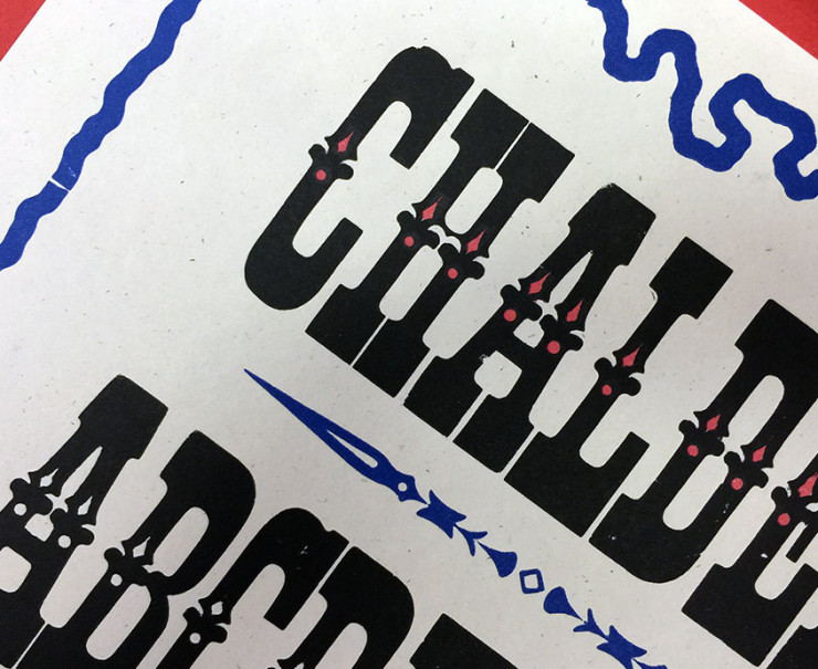
On display are selections of type specimens from The Printing Museum’s collection, which were printed in 2001-2002 by John Horn on his Vandercook Universal I Press. The specimens consist of fonts that were produced by five type manufacturers: Hamilton Manufacturing Company; William H. Page and Company; Vanderburgh, Wells & Company; Morgans & Wilcox; and Tubbs Manufacturing Company (also referred to as Tubbs & Company). These examples depict serif and sanserif fonts, including primary faces of Roman, Antique, and Gothic; secondary designs, such as Clarendon and Tuscan; and new families of type designs, such as Antique Tuscan. Further derivations can be seen in the condensed and expanded fonts, as well as Italic and outlined versions.
On view in the Lobby Gallery. All prints on display are from the permanent collection of The Printing Museum.

